BentoBin
A cloud based storage platform that allows its customers to save and share content, across all of their devices. BentoBin aims to be approachable, organized and safe–everything that cloud users need.
ROLES
- UX Research
- Visual Design
- Brand Identity
- Interaction Design
- Information Architect
DELIVERABLES
- User Surveys
- Competitive Analysis
- User Personas
- User Stories
- User Flows
- Wireframes
- Usability Testing
- Mockups
- Prototypes
TOOLS
- Figma
- InVision
- Maze
- UsabilityHub
- Google Suite
The Problem
There are many competitors for productivity applications. Each app provides their own take on creating and saving content, while keeping everything accessible across multiple devices. Despite all these variations, organization is still a huge issue. Large amounts of content with different file types can cause busy dashboards with the inability to effectively sort what is important, especially on different devices/viewports. When saving content on different devices, there can be frustration in where the content is saved and located.
The Solution
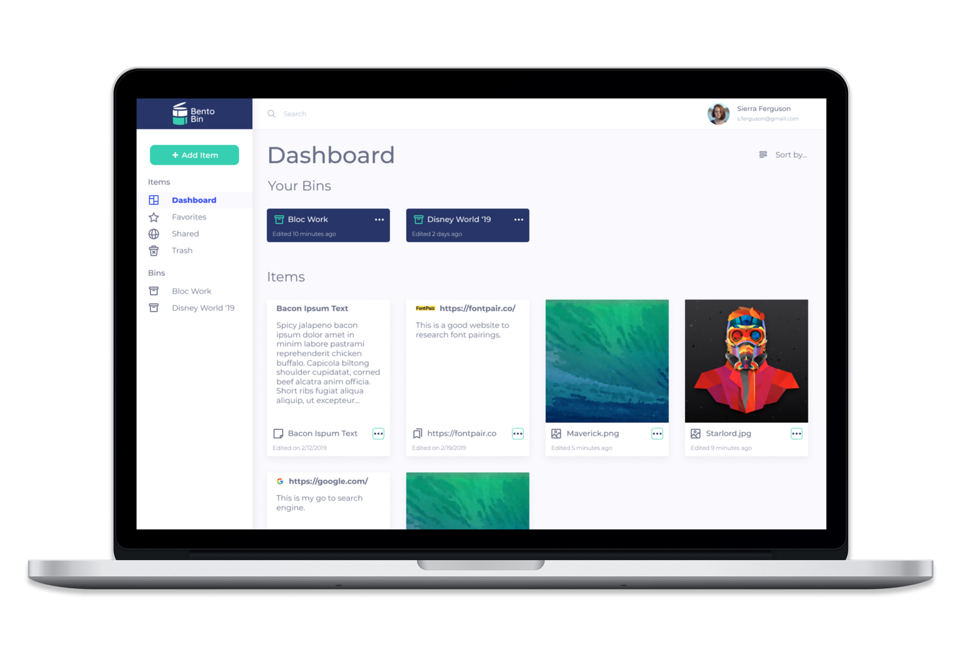
BentoBin allows you to save anything from anywhere, in one place. Organization is effortless with BentoBin’s intuitive dashboard. BentoBin organizes files in “bins” and categorizes files by type (image, note, link).
The Design Process
01 User Research
The design process began with user research to get familiar with potential users and better understand what they are looking for in a cloud-storage app. I created a google forms survey and distributed it across social media as well as other forums (slack groups, email). The survey focussed on the following:
- How many survey participants use cloud storage?
- How do they use cloud storage?
- What features do they find important?
Survey Results
Out of 20 participants:
100%
have a moderately messy dashboard
90%
use it for documents, notes, and photo backups
75%
find organization to be moderately difficult
75%
depend on cloud-based tools daily
02 Personas
After gathering the results from the survey, I conducted several follow-up interviews with survey participants to dig deeper in their experience with cloud storage apps. From analyzing both the survey results and the interview questions, two main personas who represent the users were identified.
View Full Personas
Leslie
24/Female
Admin Assistant
GOAL
- Clear organization for her saved online content (images, articles, etc).
MOTIVATIONS
- Looks for inspiration from the web constantly.
- Shares content a lot with friends.
FRUSTRATIONS
- Saves duplicate content.
- Struggles searching through content.

Rob
19/Male
Student
GOAL
- Maintain a central repository for his notes.
MOTIVATIONS
- He wants something simple and reliable.
- Views notes on both desktop and mobile.
FRUSTRATIONS
- Forgets where notes have been saved.
- Can't access his saved desktop files view mobile.
03 Competitive Analysis
I continued the research process by identifying three cloud-storage competitors, and putting them through a SWOT analysis to evaluate their strengths, weaknesses, opportunities, and threats. Google Drive, Pinterest, and Dropbox are the top cloud-storage apps that the survey participants used.
View SWOT AnalysisGoogle Drive
The Likes
- Great File Structure
- Offers Collaboration
- Cross Platform
The Dislikes
- Unavailable offline
- Weak file sharing security
The Likes
- Nice dashboard grid view
- Can bookmark across web
- Social media integration
The Dislikes
- Difficult to navigate
- Can get lost browsing
Dropbox
The Likes
- Flexible storage options
- Simple UI
- File recovery
The Dislikes
- Smaller storage options
- A lot of color-accented links
04 User Stories
I created a backlog of user stories for all the functionality needed to address the users’ problems. There was difficulty distinguishing which functions were necessary or just a “nice-to-have.” After prioritizing the user stories from highest to lowest, the highest-ranking user stories were put into the first design sprint to make up the first Minimum Viable Product (MVP).
View All User StoriesNew User Stories (MVP)
| ROLE | TASK | IMPORTANCE |
|---|---|---|
| As a new user, | I want to create an account via email and password | High |
| As a new user, | I want to create an account via Google | High |
| As a new user, | I want to select my storage allotment when I create an account | High |
| As a returning user, | I want to sign into my account | High |
| As a signed-in user, | I want to create a new note | High |
| As a signed-in user, | I want to upload a new image file | High |
| As a signed-in user, | I want to create a new folder | High |
| As a signed-in user, | I want to view a dashboard that lists all my folders and files | High |
| As a signed-in user, | I want to move an item into a folder | High |
| As a signed-in user, | I want to sort my files by Name, Kind, Date Last Opened, Date Added, Date Modified, Date Created, or by Tags | High |
| As a signed-in user, | I want to save links/online content to my account (web pages and images) | High |
05 User Flows
The following user stories were made into user flows:
- Upload a new file.
- Creating a new folder.
- Move an item into a new folder.
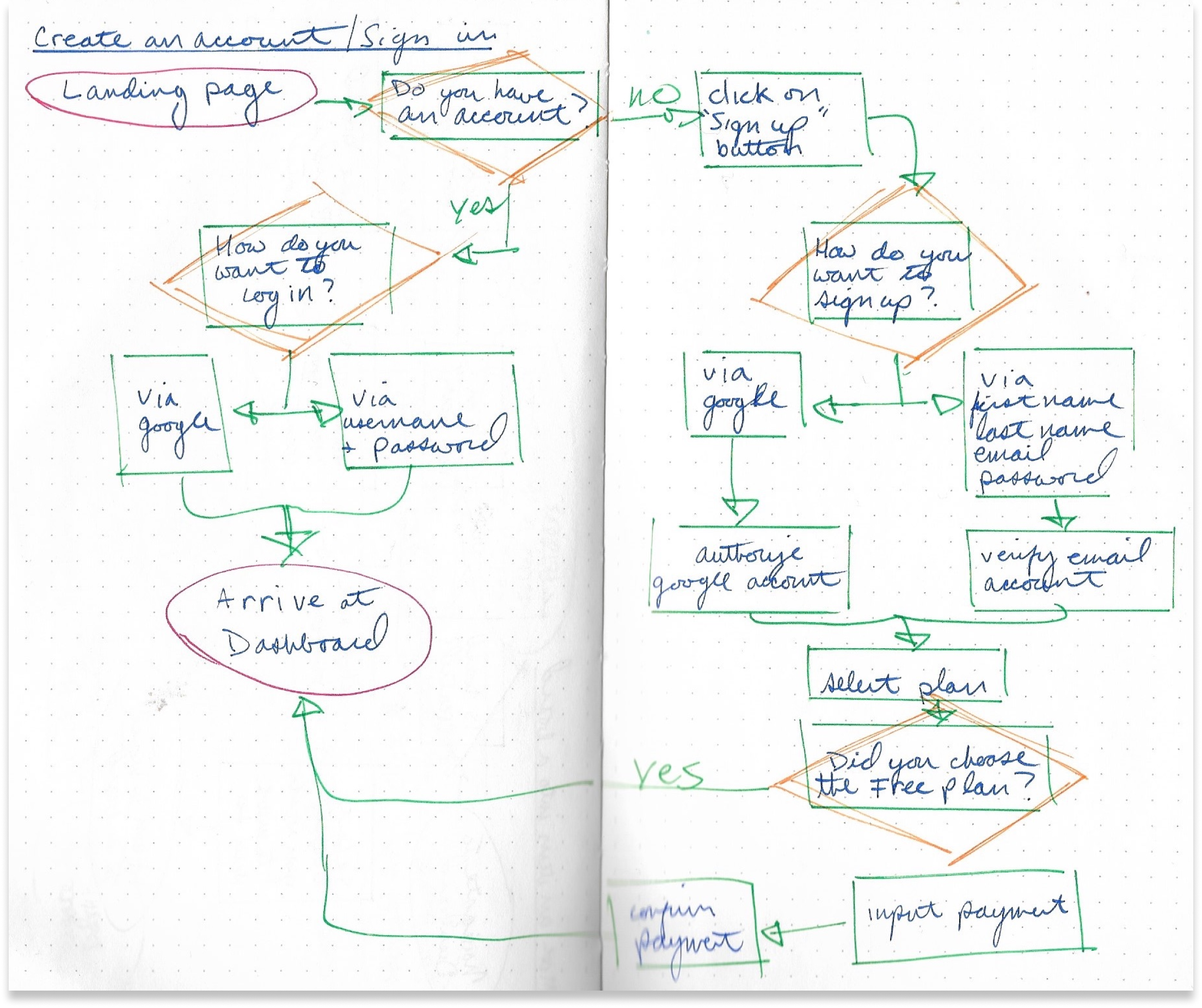
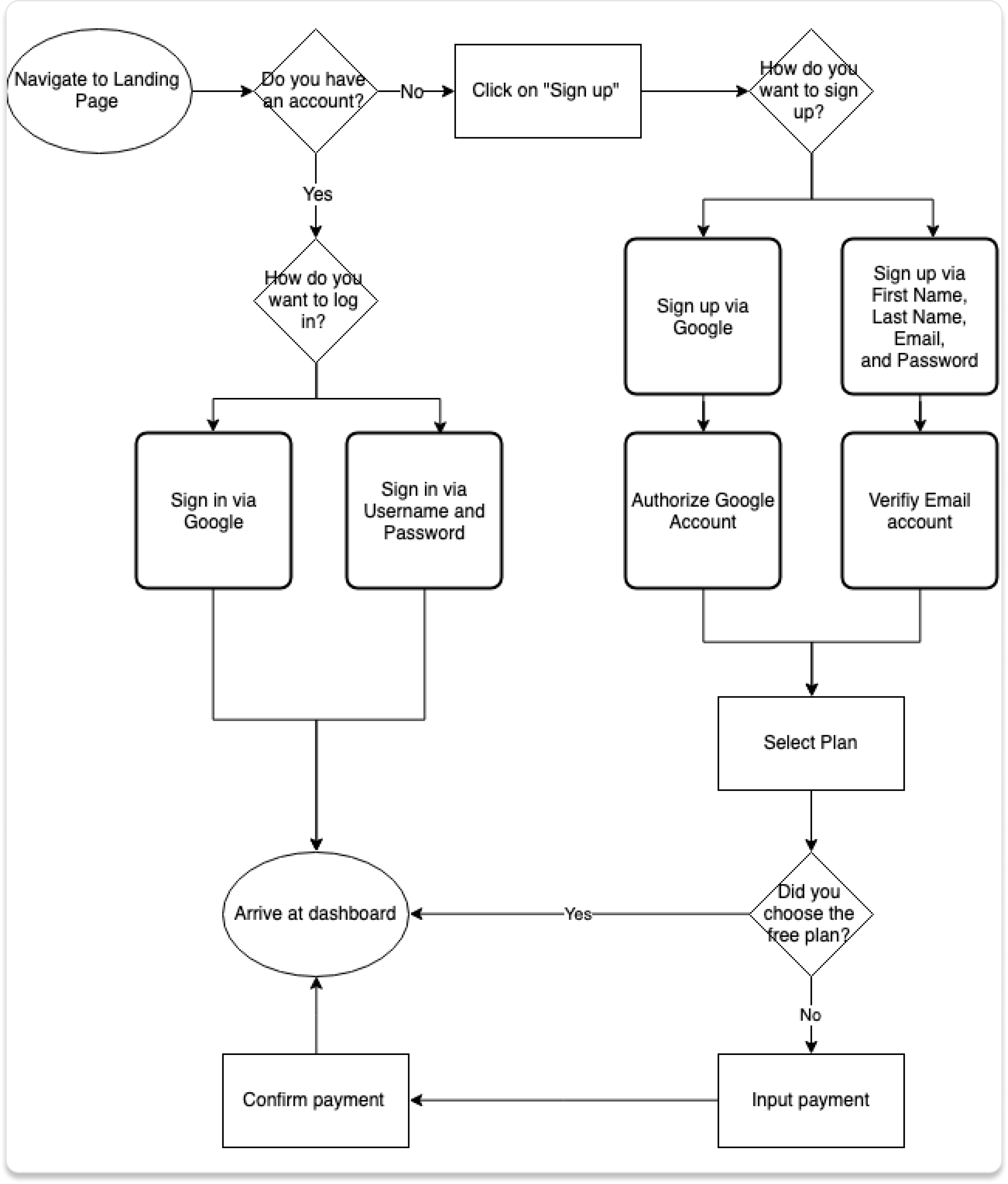
User Flow Example: Create an account.
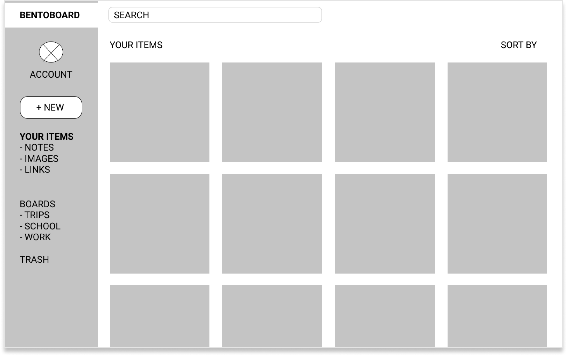
06 Wireframes and Usability Testing
Next, I moved on to the skeletal structure of the product. I sketched several iterations of each screen on paper, then used those sketches to make low-fidelity mockups using Figma.
The lo-fi wireframes were then used to conduct in-person and remote usability tests. I asked 2 participants to complete the following tasks:
- Sign up for an account
- Add a piece of content
- Organize a piece of content
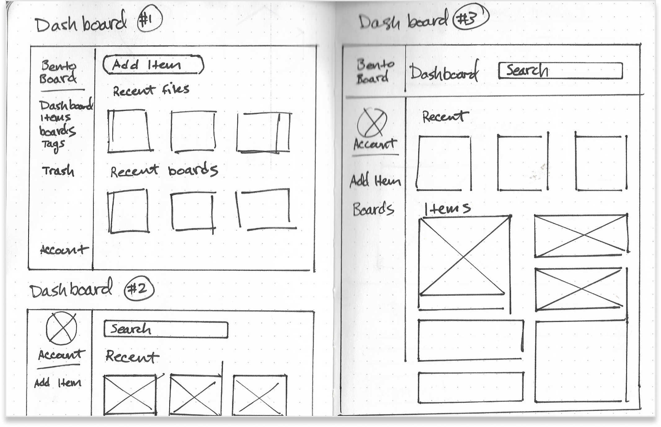
Wireframe sketches to lo-fi mockup.
Usability Testing
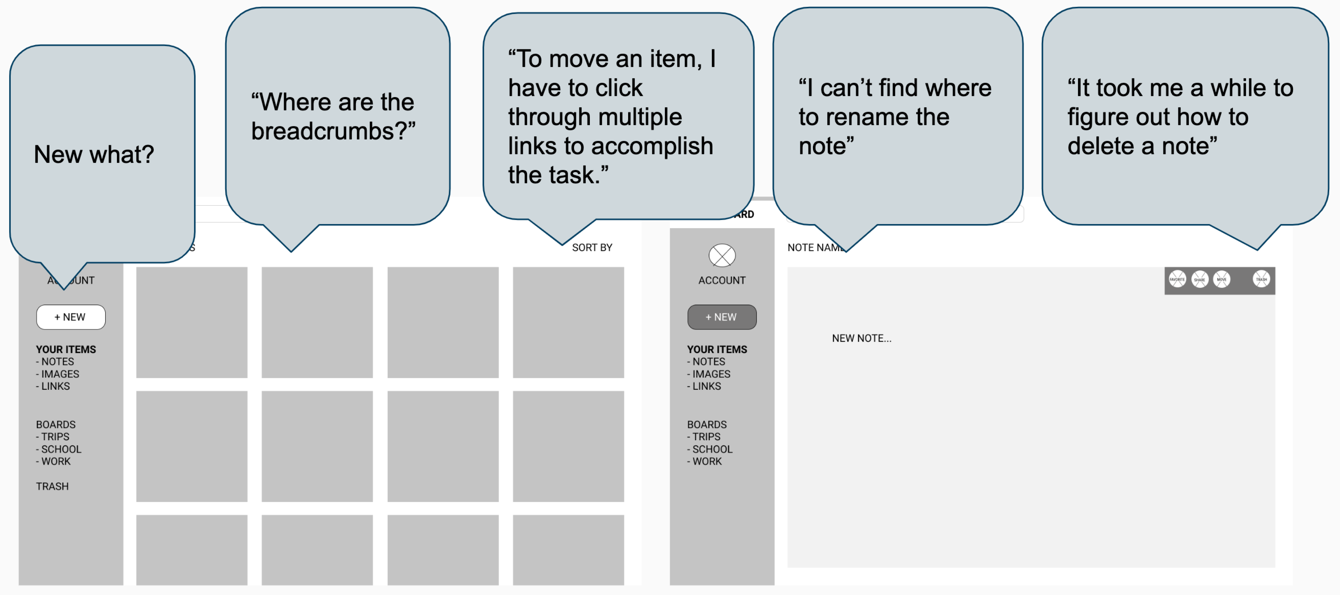
First usability test reactions.
Testing Revisions
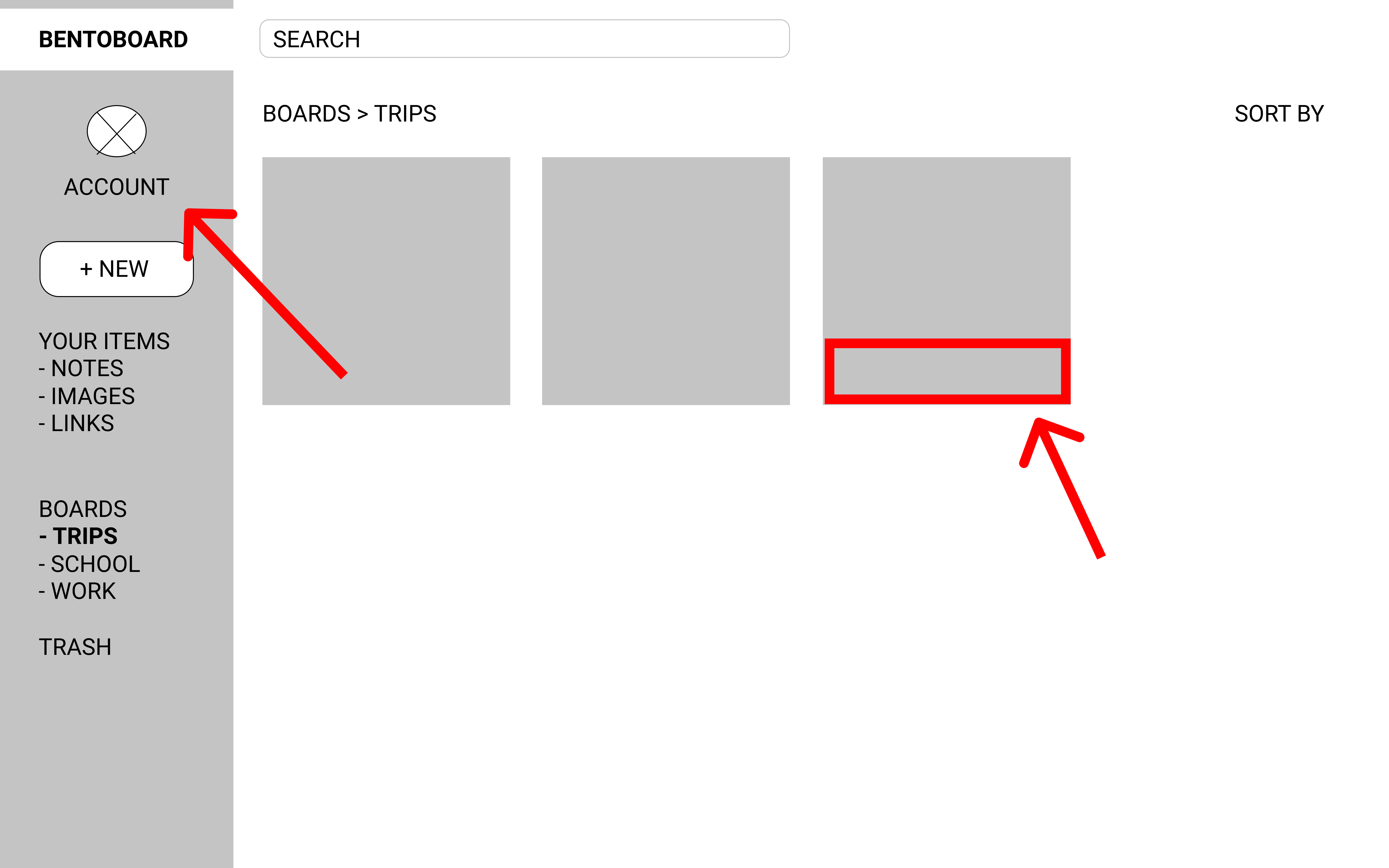
1st Round of Testing
- 1st participant took a long time figuring out how to move an item into a folder. Instead of showing the “move” option of an item on-click, he recommends showing the menu all the time within the item.
- 2nd participant noticed that the “note” and “link” preview on the dashboard looked similar. She suggests to distinguish the kind of types of files, perhaps by color or an icon of sorts.
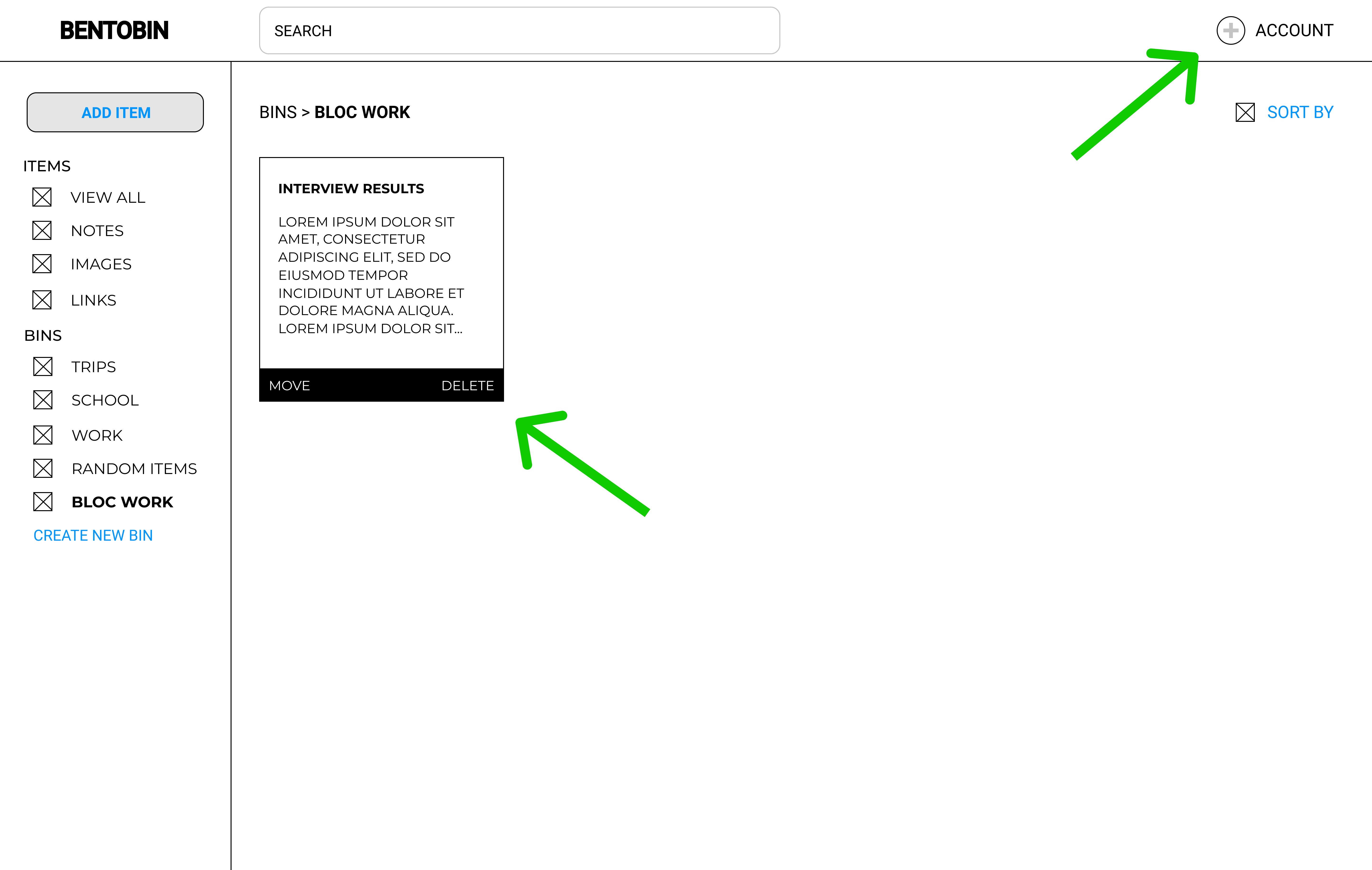
2nd Round of Testing
- 1st participant said the left nav bar looked cluttered with the Account information as the first item. I moved the Account information to the top right-hand side of the dashbaord to open up space in the left nav.
- I added the the "Move" and "Delete" options on the dashboard items based off of user feedback.
- Icons have been added to the links in the left nav to improve visability.
07 Branding
I used mind-mapping to figure out a name for the product. I jotted down 2 words that describe the cloud-service, storage and organization, then wrote several words that related to those attributes. Throughout the research process, I heard buzzwords such as minimal, approachable, intuitive, and dependable. After several iterations, I narrowed the name down to BentoBin.
View Style Guide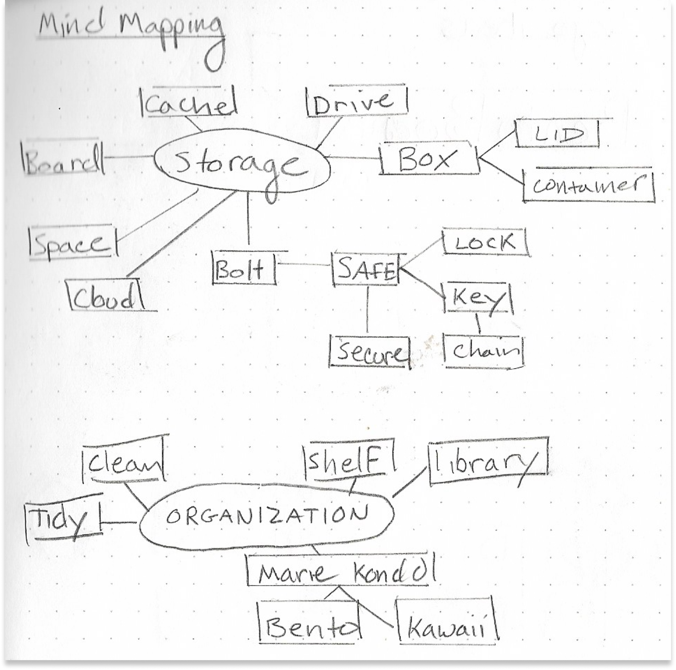
BentoBin Mind Mapping and Logo Sketches.
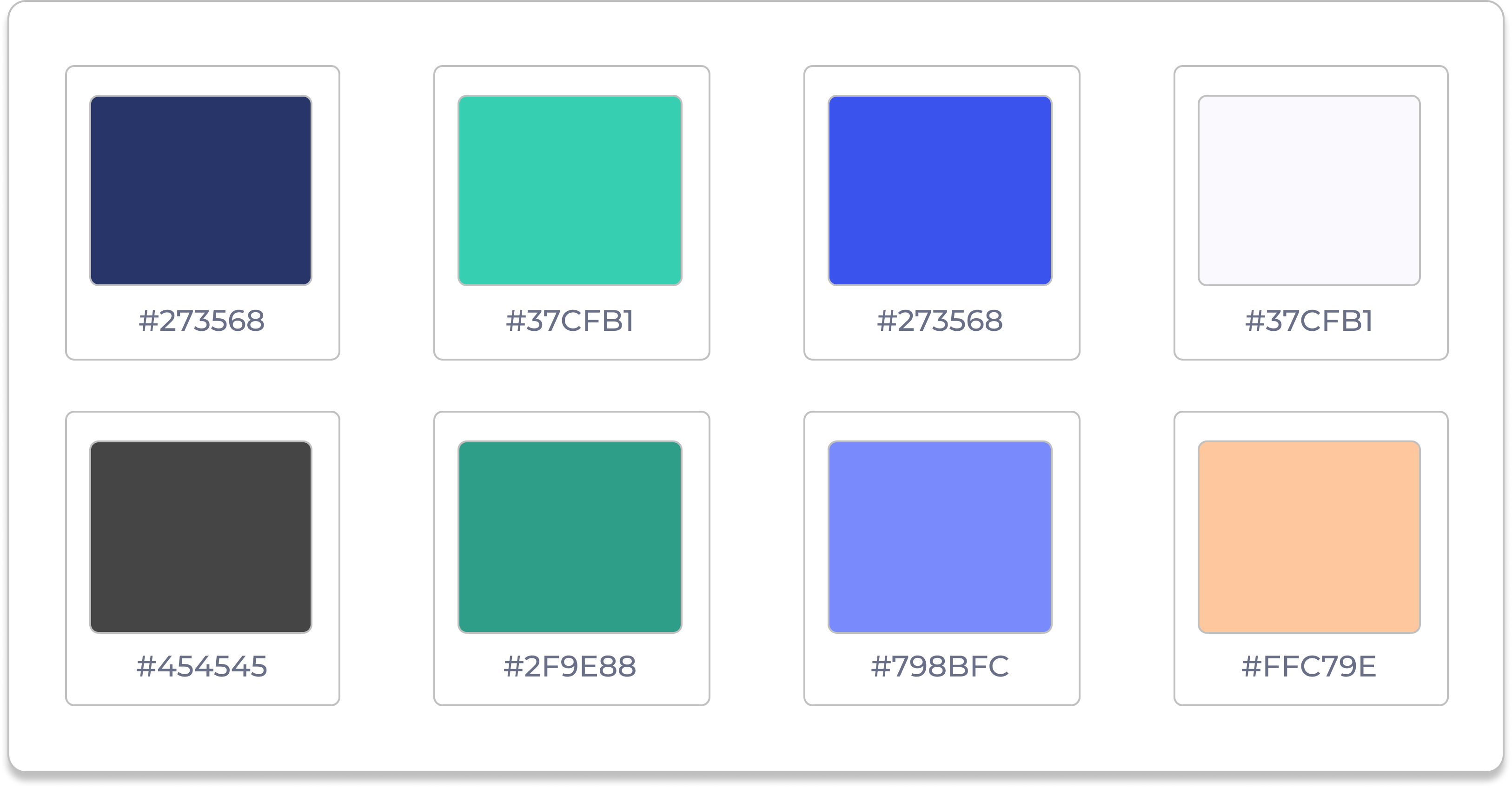
BentoBin Color Palette
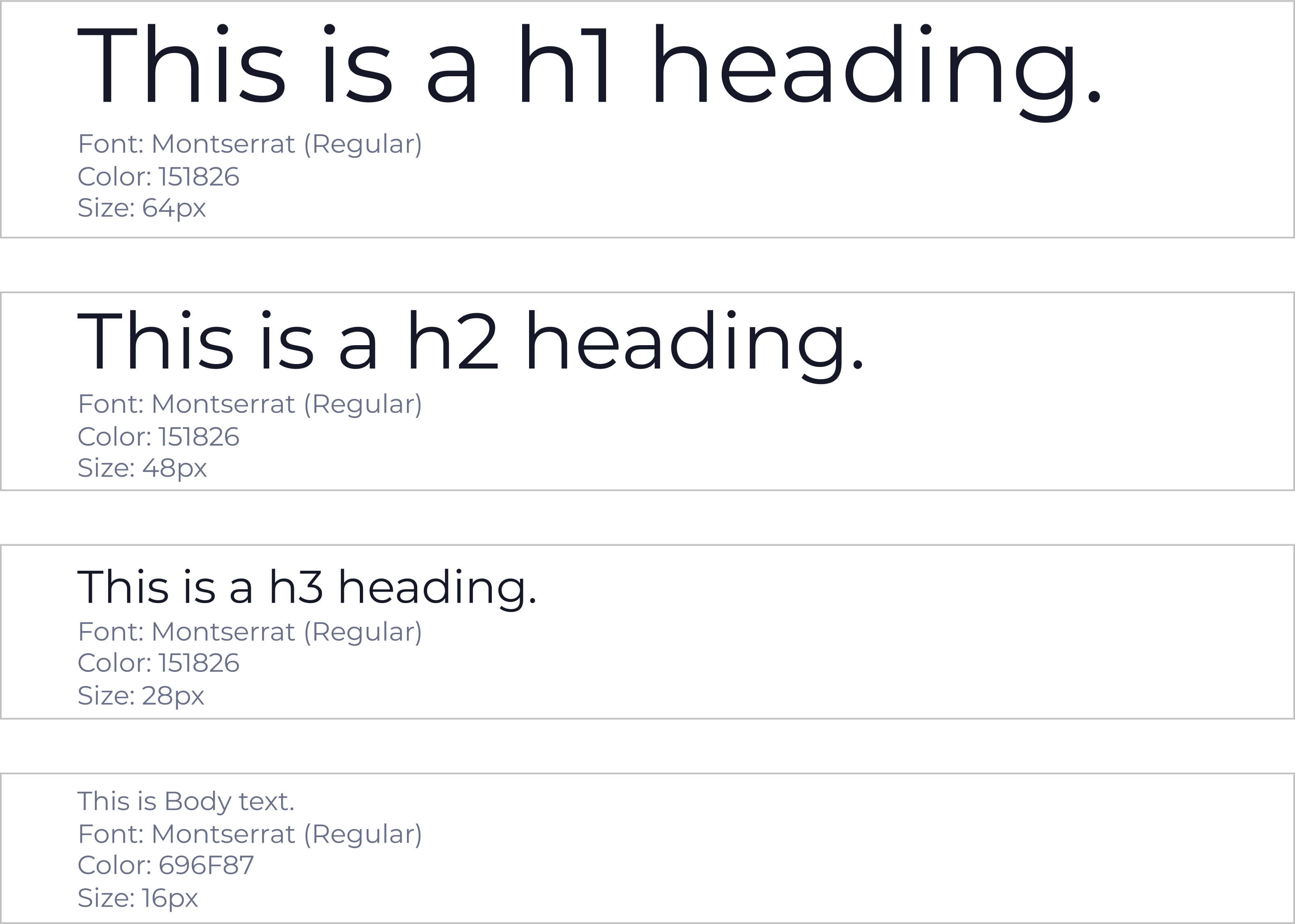
BentoBin Typography
08 Logo Iterations
I was inspired by bento boxes, the modern japanese lunchbox. Bento boxes have separate compartments that hold different parts of your lunch. The name evokes a casual, fun and “kawaii” feeling towards the brand.
I conducted a preference test with 12 participants to see which logo stood out the most:
Logo 1:
0% voted for this option.
Logo 2:
20% voted for this option.
Logo 3 (Winner):
80% voted for this option.
09 Mockups and Preference Testing
I applied all the branding (colors, typography, imagery) to the wireframes to create BentoBin’s initial high-fidelity mockups. I put my mockups up for testing at UsabilityHub.I created two variations of three different elements and conducted three preference tests on all three.
Out of 6 participants, 2 preference tests had unanimous winners while 1 preference test was split 50/50. Participants left great feedback after testing and provided great insight such as “the 1st mockup was cleaner and required less cognitive load.”
Sign-In Page A/B Testing
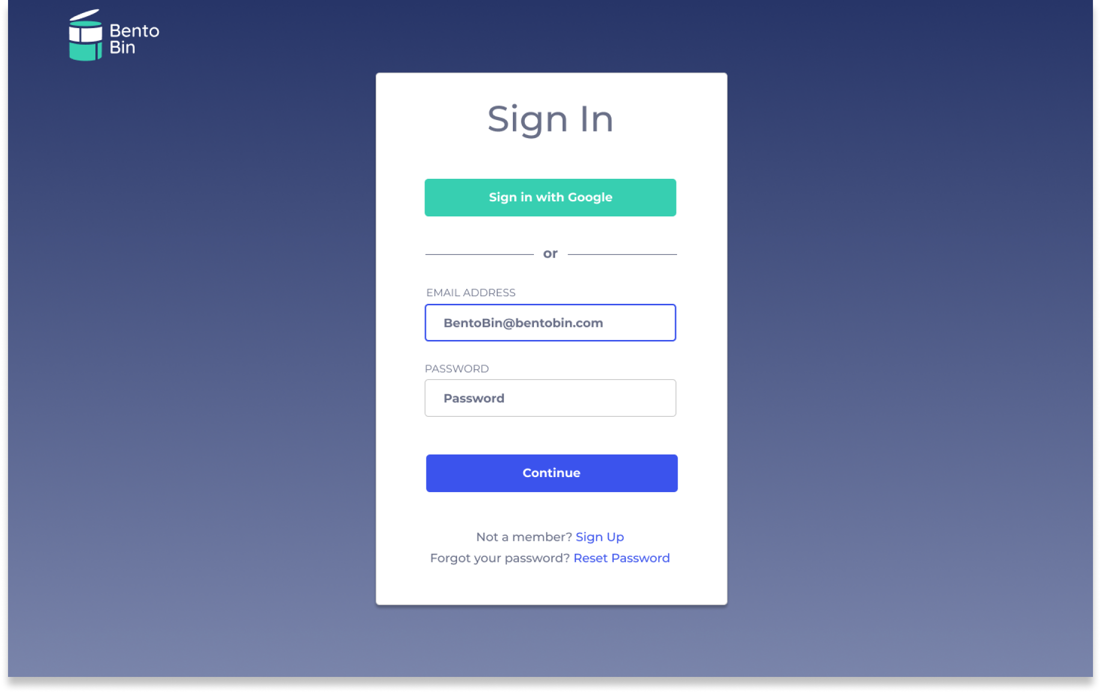
Option 1
Field lables are above the text field and no Google logo.
50% voted for this option.
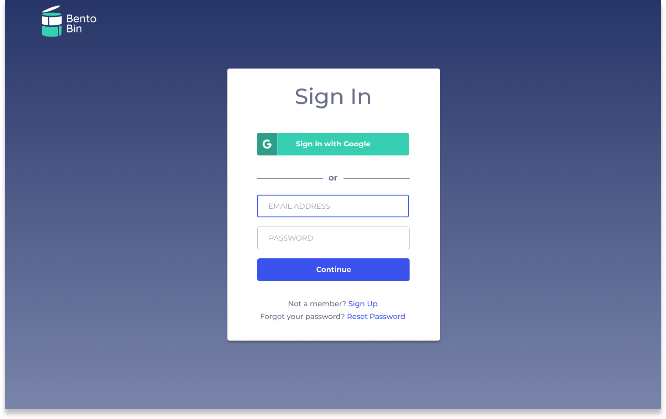
Option 2 (WINNER)
Field lables are inactive text within the text field.
50% voted for this option.
Dashboard Page A/B Testing
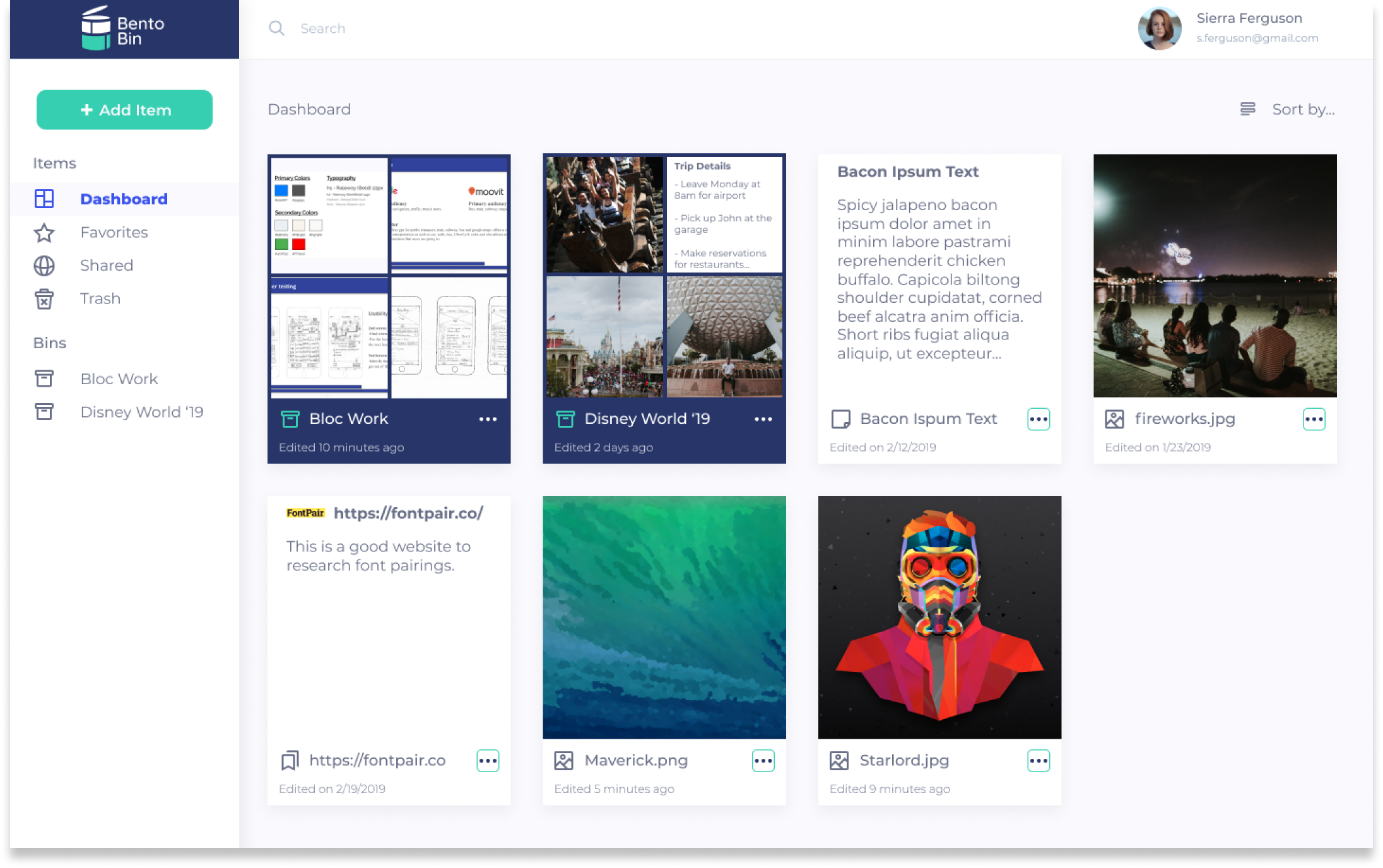
Option 1
Folders show first 4 items within, and is organized within items section.
33% voted for this option.
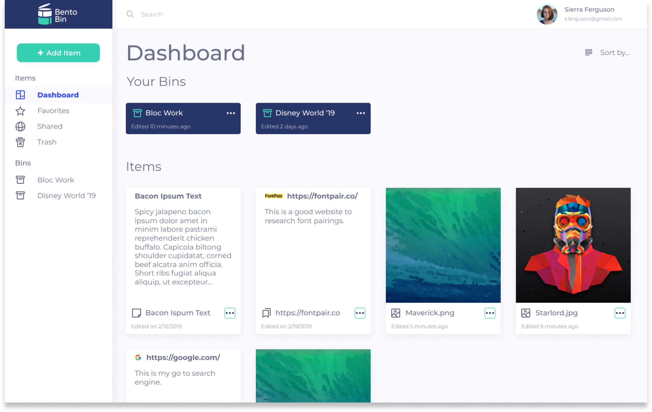
Option 2 (WINNER)
Participants say “it's' well designed, not too busy, and can see both folders and individual files at the same time.”
67% voted for this option.
Conclusion
What did I learn?
The cloud-storage marketplace is somewhat over saturated with apps that have great designs with a lot of functionality. But despite the over saturation, cloud-storage users still need better solutions to solve cloud-storage problems such as making organization better, or allowing the user to add content faster. I would have never found these problems if it weren't for user research and multiple user testing. Based off of these problems, I focused on improving content organization and minimizing dashboard clutter.
If given more time, I would continue designing important functions such as search and sharing capabilities. I would expand the use of this app from “casual users” to “professional users” who use cloud-storage for corporate needs. This would require more user research and testing by corporate users, as well as upper management.
All-in-all, I learned that applying the research-driven design process to the problem will achieve an effective solution.
View Desktop Prototype